Content types
- Boat is used to place an image and link for a vessel on a trip (product) page, to help customers find boat specific information. Trip need to be manually linked via product codes in this content type.
- Campaign content is for non-permanent site content related to a promotion, campaign or short term partnership. As a result it's usually not linked to the main site navigation, except via the Travel Deals section.
- Content Collections are used to store content (images and text) that can be formatted to display on a page in various ways.
- Destination content has a pre-formatted display, with editable fields such as introduction text, highlights and images, as well as infomration in the FAQs.
- Pages are used for evergreen permanent site content that requires bespoke formatting.
- Product content has a pre-formatted display for all trips. The majority of editable product content is automatically fed from the Hybris Content Management System, or linked to Elements.
- Webforms are used to collect custome data, with the ability to tailor the customer flow. These are used for competitions and promotions. Data is saved in Drupal, and can be automated to email a nominated address.
- Promotion Webforms are editable webforms similar to webforms where customer data automatically feeds to Salesforce.
*When logged in you will only see the above content types as defined by your role in Drupal.
To add a new page
Pages are used for evergreen permanent site content that requires bespoke formatting.
- Go to Content and Add content.
- Select the Page content type.
- You will be taken to the editor where you can add content.

To add a new Campaign
- Go to Content and Add content.
- Select the Campaign content type.
- You will be taken to the editor where you can add content.
To edit an existing page/campaign
- Go to the page you wish to edit.
- Select Edit tab from the top of the page.

Basic set up and content
- Page / Campaign title - This is the title that shows on top of the banner image at the top of the page and is the H1. It is important the Page Title is optimised for SEO if the page is a permanent page and to be indexed by Google.
- Banner image - The image that shows on the top of the page. The banner image must be 1920 x 500 pixels in size, 72dpi, save for web.
- Active date - Select when you would like the page to be live/come down. All time periods outside what has been specified will be re-directed to a 404 page.
- Body - This is where you add the content of your page. You can add images, style copy, insert columns, and add content using the icons in the editing bar below.

Key WYSIWYG functions
WYSIWYG stands for "What you see is what you get" and is the area where you make all your page content edits.
Hyperlinks
To add a link to some text:
- Highlight the text you wish to link
- Select the link icon
![]() and a pop up will appear where you can add your link.
and a pop up will appear where you can add your link.
 and a pop up will appear where you can add your link.
Internal links
For internal links (a link to another page on the website):
- Set the Protocol to <other>
- Add the relative URL to the URL field
- The relative URL refers to the tail end of the URL i.e. the part of the URL which comes after the domain name.
- e.g. To link to http://www.intrepidtravel.com/en/asia you would use asia for the URL.
- Click OK
External links
For external links (links to another website):
- Leave the Protocol as http://
- Add the full URL to the URL field
- Click on the target tab and set the target to New Window (_blank)
- This ensures that the link will open in a new tab/window, which is best practice for external links
- Click OK
Linking to an email
- Highlight the text you wish to link to the email (usually an email address)
- Click the link button
- Set the link type to email
- Add the to email address to the email address field
- Click OK
Anchors
Use anchors to link to places within a page. Anchors are especially useful for long pages where you have a lot of content. They can also be used to add a side navigation to your page.
To add an in text anchor
- Place your cursor at the start of the text you want to anchor to
- Select the flag icon to add a text anchor
![]()
- Give the anchor a unqiue ID (the same ID cannot be used for an anchor on the same page more than once)
- Click OK

Linking to an anchor
- Highlight the text you wish to link to
- Click the link button
- Set the link type to Link to anchor in text
- Select your anchor from the drop down list
- Click ok
Side Menus
To add a side menu (Please note this option is available on Intrepid only)
- Place your cursor at the start of the text you want to anchor to
- Select the pin icon to "insert H2 anchor"
![]()
- Note: For a heading to show in the sidebar menu it must be in H2 (Heading 2) format
- Give the anchor a unqiue ID (the same ID cannot be used for an anchor on the same page more than once)
- Click OK
- Add "Pin" anchors to each of the headings you want to show in the sidebar menu
- Scroll down the page and select the check box for Anchor menu
- Save the page - your menu will now display down the right hand side of the page.

Columns/templates
For your page content to show in columns:
- Select the template icon
![]()
- Choose 2 x 50% columns no bleed option
- You will be presented with a table with Column 1 content and Column 2 content
- Add your content in the relevant columns
- Your content will respond with the screen size, and move to a one column display on mobile devices.

Advanced formatting
For extra formatting code you can check out the Bootstrap CSS page - http://getbootstrap.com/css/
Styling and formatting
Text formating
To format your text highlight it and select a text formatting option from the Format drop down. Options include:
Heading 2
Normal
Heading 3
Heading 4
Heading 5
Heading 6
Text styling
To add styling to your text, highlight it and select the style you would like to apply from the style drop down. Text styling options include:
Lead Paragraph
Alerts
There are four alert options. To style your text as an alert highlight it and select the alert style from the drop down. Options include:
Tables
To add styling to a table:
- Create your table and table content.
- Place your cursor inside the table.
- Select the table style you would like to apply from the Styles drop down.
- Table style options include: Table, Striped, Hover, and Striped & Hover.
| Table | Table |
| Table | Table |
| Table | Table |
| Table Striped | Table Striped |
| Table Striped | Table Striped |
| Table Striped | Table Striped |
| Table Hover | Table Hover |
| Table Hover | Table Hover |
| Table Hover | Table Hover |
| Table Striped & Hover | Table Striped & Hover |
| Table Striped & Hover | Table Striped & Hover |
| Table Striped & Hover | Table Striped & Hover |
Buttons
To add a button:
- Type the text you would like your button to display in the WYSIWYG.
- Link the text that you want to show on the button to the page you would like it to direct to.
- NOTE: For the button to work all the text that you want to show on the button must be linked.
- Place your cursor within the linked text and select the button style you would like to apply from the Styles drop down.
- Button style options include: Default, Primary, Secondary, and Tertiary.
Icons
When we have three icons, for example on a trip page, text should ideally be centre-aligned (but this requires development work):
In all other cases, for example a Why Choose Intrepid block, text should be left-aligned, as per the rest of the website:
Default Primary Secondary Tertiary
Content collections
Content collections are used to group together pieces of content and then insert it into a page in the display you want. Content collections can be used to insert things like image galleries, accordion tables, or text with images on your landing page.
To create a content collection:
- Go to Content and Add content.
- Select the Content Collection content type.
- You will be taken to the editor where you can create a new content collection.
- Give your content collection a title that is something you will remember and is easy to refer to - the main title will not display anywhere on your content collection when inserted into a page.
- Add the content that you want to display on the page through the CONTENT COLLECTION section. Here you can add:
- Title - this will show as the visible copy on an accordion display, or heading or overlay text for other displays.
- Body - this will show as the copy when an accordion display is expanded, or text below or next to an image for other displays.
- Image
- Link > Title - text that will show on the CTA button
- Link > URL - where the image or CTA will link to
- NOTE: Not all of these fields are compulsory but you will need to add at least one.
- To add a new item to pull to your content collection click "Add another item".
- Save your changes
To insert a content collection into a page:
- Edit your content collection
- Copy the node ID from the URL of the content collection e.g. the node ID for this URL https://www.intrepidtravel.com/au/node/3086/edit is the node is 3086
- Edit the page where you want to insert your content collection
- Select the red A icon in the WYSIWYG editor and enter the node ID
- Select your display and layout preferences in the output tab
- Click OK and save your changes
Shortcodes
Shortcodes are used to insert all different kinds of content into a page, without requiring the assistance of a designer or a developer. Shortcodes can be used to insert:
- Content collections (via aggreagte shortcode)
- Products
- Departures
- Reviews
- Blogs
- Videos
- Web forms
Aggregate shortcode
Aggregate shortcodes are used to insert custom content (created via a content collection) into a page.
To insert an aggregate shortcode:
- Get the node ID from your content collection by editing the page and copying the node ID from the URL.
- e.g. for the following URL the node is 3086 https://www.intrepidtravel.com/au/node/3086/edit
- You can locate content collections in the back end by clicking on Content in the top menu and then filtering for type Content Collection
- Click on the red A in the WYSIWYG menu
- Enter the node ID for your content collection into the node field
- Select your preferred display
- Select your preferred layout option
Aggregate display options
Accordion
These are cross-country food tours designed to fully immerse you in a destination's food scene. Taste the freshest market produce, meet artisanal producers, find the best street food and learn the subtle changes in regional cuisine. But although these trips are packed with flavour, we haven't left out the essence of Intrepid travel: each real food adventure is filled with cultural exploration, historic highlights and plenty of grassroots travel. They're just seasoned to perfection - food travel at its best!
Image

Image left, text right
Real Food Adventures
These are cross-country food tours designed to fully immerse you in a destination's food scene. Taste the freshest market produce, meet artisanal producers, find the best street food and learn the subtle changes in regional cuisine. But although these trips are packed with flavour, we haven't left out the essence of Intrepid travel: each real food adventure is filled with cultural exploration, historic highlights and plenty of grassroots travel. They're just seasoned to perfection - food travel at its best!
View all food tripsImage top, text bottom
Real Food Adventures
These are cross-country food tours designed to fully immerse you in a destination's food scene. Taste the freshest market produce, meet artisanal producers, find the best street food and learn the subtle changes in regional cuisine. But although these trips are packed with flavour, we haven't left out the essence of Intrepid travel: each real food adventure is filled with cultural exploration, historic highlights and plenty of grassroots travel. They're just seasoned to perfection - food travel at its best!
View all food tripsTitle overlay image, text bottom
These are cross-country food tours designed to fully immerse you in a destination's food scene. Taste the freshest market produce, meet artisanal producers, find the best street food and learn the subtle changes in regional cuisine. But although these trips are packed with flavour, we haven't left out the essence of Intrepid travel: each real food adventure is filled with cultural exploration, historic highlights and plenty of grassroots travel. They're just seasoned to perfection - food travel at its best!
View all food tripsTitle overlay image
Product shortcode
To insert a product shortcode:
- Select the red P from the WYSIWYG menu.
- You can select which products you want to display based on the following information:
- Marketing region - this refers to continent or region e.g. Asia, Africa, Galapagos Islands
- Primary country or countries visited - use the country's two letter code e.g. AU for Australia. A list of these codes is available here.
- Start or finish city
- Theme - e.g. food, family
- Style - e.g. original, basix
- Trip code - you can include or exclude specific trip codes
- Number of products to display
- Display order - you can order by marketing rating (default), traveller rating, or price.
- After setting the products you want to display, you will need to set the way you want the products to display from the output tab.
Product display options
Image card

10 Days
From
1156
Take a tour of Vietnam from Hanoi to Ho Chi Minh City, with stops to cruise the Mekong...

Map card
10 Days
From
1156
Take a tour of Vietnam from Hanoi to Ho Chi Minh City, with stops to cruise the Mekong...
List
| Trip Name | Days | Start city | Destination | Style | From USD | |
|---|---|---|---|---|---|---|
| Vietnam Express Southbound | 10 |
Hanoi |
Vietnam |
Original |
|
|
| Sydney to Cairns Adventure | 14 |
Sydney |
Australia |
Original |
|
|
| Classic Costa Rica | 15 |
San Jose |
Costa Rica |
Original |
|
Departure shortcode
To insert a departure shortcode:
- Select the red D in the WYSIWYG menu
- You can select which departures you want to display based on the following information:
- Length - After x days in the future
- Earliest or latest departure date
- Minimum or maximum price - this can be set for a particular currency
- Product code or ID
- Marketing region - this refers to a continent or region e.g. Asia, Africa, Galapagos Islands
- Primary country or countries visited - use the country's two letter code e.g. AU for Australia. A list of these codes is available here.
- Number of departures to display
- Display order - by price or departure date
- Push - tick to display only sale products
- Limit to one departure per product
- After setting the products you want to display, you will need to set the way you want the products to display from the output tab.
Departure display options
Image card
Table
| Departing | Trip name | Days | From USD | |
|---|---|---|---|---|
30 Apr 2024Premium Sicily |
Palermo to Catania |
10 |
|
|
1 May 2024Peru Encompassed |
Lima to Lima |
20 |
|
|
3 May 2024Everest Base Camp Trek |
Kathmandu to Kathmandu |
15 |
|


Table with image
Review shortcode
To insert a review shortcode:
- Select the red R in the WYSIWYG menu
- You can select which reviews you want to display based on the following information:
- Minimum star rating
- Product name or code
- Marketing region - this refers to a continent or region e.g. Asia, Africa, Galapagos Islands
- Primary country or countries visited - use the country's two letter code e.g. AU for Australia. A list of these codes is available here.
- Show aggregation - change to yes if you want to show review aggregate
- Show modal - change to yes if you want to show "show more" with pop up to more reviews
- After setting the reviews to display, you will need to set the way you want the reviews to display from the output tab.
Review display options
Review star top
Review star left (with aggregate)
Blog shortcode
To insert a blog shortcode:
- Select the red B in the WYSIWYG menu
- You can select which blogs you want to display based on the following information:
- Category - each blog has been tagged with a category. If there are particular blogs you want to bring in to a page contact the copy team and they can arrange for the appropriate tags to be added for you.
- Select your preferred display
- Set your preferred layout option
Blog display options
Blog card

Apr 01, 2024
Savor Delhi with the best of the...
Check out this insider's guide to Delhi's street food. With most Intrepid trips...
Title overlay image
Video shortcode
To insert a video shortcode:
- Select the red V in the WYSIWYG menu
- Add the URL for the video you wish to add. For Youtube videos you need to:
- Go to the video page on Youtube
- Click share and copy the URL from the field below - this is the URL you need to enter for the shortcode.
- Set your display width - this will default to full width but you can adjust for a range of sizes if need be.

Example of full width video shortcode
Shortcode layout options
After selecting the content you wish to display in your shortcode, you then need to select a display and layout for the shortcode. Layout options include:
You also have the option to select if you want padding on the shortcode, or if you would like pagination on the carousels.
Columns/slides across devices
To enusre that the content inserted via a shortcode displays best across devices you can set how many columns/slides of content you would like to display for each screen size (mobile, tablet, desktop and desktop wide).
When inserting shortcodes make sure you test your page across devices to see if your layout works well for each view.

Grid
Product (image card)
10 Days
From
1156
Take a tour of Vietnam from Hanoi to Ho Chi Minh City, with stops to cruise the Mekong...

14 Days
From
3664
See the natural wonders of Queensland and New South Wales on an adventure through the...

Tailor-Made trips
Take four or more on an exclusive trip and tailor your itinerary

15 Days
From
2129
Travel to Costa Rica and discover a tropical playground of immense natural beauty....

Aggregate (image, no padding)


Carousel responsive
Product (image card with pagination)
10 Days
From
1156
Take a tour of Vietnam from Hanoi to Ho Chi Minh City, with stops to cruise the Mekong...
14 Days
From
3664
See the natural wonders of Queensland and New South Wales on an adventure through the...
15 Days
From
2129
Travel to Costa Rica and discover a tropical playground of immense natural beauty....

9 Days
From
981
Travel to Bali and experience this oasis off the coast of Indonesia. Bali's Ubud, Mt...


13 Days
From
1637
Uncover the heart of Morocco on a journey from Casablanca to Marrakech, through Roman...


15 Days
From
2291
Discover the must-sees, must-eats, and must-meets of gorgeous Sri Lanka on this 15-day...

7 Days
From
1377
Travel to Peru to discover Peru's ancient civilisation. Trek or train to Machu Picchu,...


10 Days
From
1156
Travel through Vietnam from Ho Chi Minh City to Hanoi. Visit the Mekong Delta, cruise...


15 Days
From
3660
Discover the secrets of Morocco on a Premium journey through Casablanca, Fes, the...


8 Days
From
2338
Travel to Italy on a tour from Rome to Amalfi and explore the best of the region....


18 Days
From
2160
Travel into the heart and soul of South East Asia on this tour of Vietnam and Cambodia....

Tailor-Made trips
Take four or more on an exclusive trip and tailor your itinerary

8 Days
From
3243
See Iceland on this eight-day tour that travels to Reykjavik, the Golden Circle,...

Aggregate (image no pagination)
Carousel fixed
Product (image card)
10 Days
From
1156
Take a tour of Vietnam from Hanoi to Ho Chi Minh City, with stops to cruise the Mekong...
14 Days
From
3664
See the natural wonders of Queensland and New South Wales on an adventure through the...
15 Days
From
2129
Travel to Costa Rica and discover a tropical playground of immense natural beauty....
9 Days
From
981
Travel to Bali and experience this oasis off the coast of Indonesia. Bali's Ubud, Mt...
13 Days
From
1637
Uncover the heart of Morocco on a journey from Casablanca to Marrakech, through Roman...
15 Days
From
2291
Discover the must-sees, must-eats, and must-meets of gorgeous Sri Lanka on this 15-day...
7 Days
From
1377
Travel to Peru to discover Peru's ancient civilisation. Trek or train to Machu Picchu,...
10 Days
From
1156
Travel through Vietnam from Ho Chi Minh City to Hanoi. Visit the Mekong Delta, cruise...
15 Days
From
3660
Discover the secrets of Morocco on a Premium journey through Casablanca, Fes, the...
8 Days
From
2338
Travel to Italy on a tour from Rome to Amalfi and explore the best of the region....
18 Days
From
2160
Travel into the heart and soul of South East Asia on this tour of Vietnam and Cambodia....
Tailor-Made trips
Take four or more on an exclusive trip and tailor your itinerary
8 Days
From
3243
See Iceland on this eight-day tour that travels to Reykjavik, the Golden Circle,...
Aggregate (image)
Carousel centred
Product (image card)
10 Days
From
1156
Take a tour of Vietnam from Hanoi to Ho Chi Minh City, with stops to cruise the Mekong...
14 Days
From
3664
See the natural wonders of Queensland and New South Wales on an adventure through the...
15 Days
From
2129
Travel to Costa Rica and discover a tropical playground of immense natural beauty....
9 Days
From
981
Travel to Bali and experience this oasis off the coast of Indonesia. Bali's Ubud, Mt...
13 Days
From
1637
Uncover the heart of Morocco on a journey from Casablanca to Marrakech, through Roman...
15 Days
From
2291
Discover the must-sees, must-eats, and must-meets of gorgeous Sri Lanka on this 15-day...
7 Days
From
1377
Travel to Peru to discover Peru's ancient civilisation. Trek or train to Machu Picchu,...
10 Days
From
1156
Travel through Vietnam from Ho Chi Minh City to Hanoi. Visit the Mekong Delta, cruise...
15 Days
From
3660
Discover the secrets of Morocco on a Premium journey through Casablanca, Fes, the...
8 Days
From
2338
Travel to Italy on a tour from Rome to Amalfi and explore the best of the region....
18 Days
From
2160
Travel into the heart and soul of South East Asia on this tour of Vietnam and Cambodia....
Tailor-Made trips
Take four or more on an exclusive trip and tailor your itinerary
8 Days
From
3243
See Iceland on this eight-day tour that travels to Reykjavik, the Golden Circle,...
Aggregate (image)
Merchandising
Merchandising is used to manage campaign content for the website via the one location. Using the merchandising function you can update the offers menu, notifcation bar and home and offers page tiles all from the one location.
To set up merchandising for your campaign:
- Go to Content > Merchandising > Add merchandising.
- Give your merchandising a title that references your region so that it is easy to see which merchandising belongs to who.
- In the landing page URL field enter the path to the campaign page e.g. for http://www.peregrineadventures.com/europe, use europe as the path.
- If your campaign is starting/ending on a specific date you can set the active date.
- Note the times are set to UTC so you may need to update the timezone for your region.
- Set the regions that your campaign is to be active for. If you do not set a region your merchandising will not show anywhere.
- Activate the type of merchandising you want to use for your campaign by adding content to one of the below sections.
Which merchandising option gets first preference?
Ordering of merchandising currently works off date, and the most recently created merchandising item will be put in the first position/override previous merchandising in the same position.
If you want to bump an existing merchandising item higher or lower, use the active dates to adjust. The most recent date will be the first item, the oldest will be the last.
Homepage banner
This overrides the homepage banner.
Offers menu
If you want your campaign to show in the offers menu set some text in the offers menu field. The menu item will link to the landing page URL you have set.
The most newly added menu item will show first.
NOTE: There is web caching on the menus so it may take a few hours for your changes to come through.

Notification bar
To add a notification bar for your campaign:
- Add some message copy - the wording that will show on the bar.
- Add a call to action - clickable copy which will link to the landing page you have set.
- Set the included URL - pages that the notification bar is to show on.
- Specify pages by using their paths e.g. for https://www.peregrineadventures.com/europe, use europe as the path.
- You can also exclude pages that you don't want the notification to show on using excluded URL
- If you want your notification bar to show on several pages for the same region you can use a wildcard e.g. all Thailand trips would be thailand/*
- To show the notification sitewide just use * - if you are using sitewide makes sure to exlcude the campaign landing page as the user will just keep looping otherwise.
- <front> is the homepage.
- Set included product codes - if there are particular trips that your campaign is applicable to you can set the trips it will show on by adding their product codes.

Merchandising shortcode
Merchandising shortcode is used to set the campaign tiles for the homepage and offers page. This shortcode can also be used if you would like to feature all available offers on a landing page.
To add a campaign tile to the homepage campaign or offers page:
- Upload your campaign tile to the image field (size 1100 x 735 px).
- Add a title - this is the text that will show over the image.
- Add a call to action - the call to action text will show on a button.
Adding merchandising shortcode to a landing page
To add merchandising shortcode to a landing page:
- Select the red M at the top of the WYSIWYG.
- Select your preferred display and layout type.
- Active campaign tiles for your region will now show on the landing page.
Promotion content in trip pages
Promotion content in trip pages is used to add campaign content to trip pages (mainly used for Qantas at the moment). When this merchandising type is added it will show below the departures on a trip page.
To add promotion content to a trip page:
- Add the codes for the trips that you want the content to show on.
- Add your content to the WYSIWYG
- Save your changes

Promotion content in destination pages
Promotion content in destination pages is used to add campaign content to destination pages (mainly used for Qantas at the moment). When this merchandising type is added it will show below the trip carousel on a destination page.
To add promotion content to a destination page:
- Add the URL for the destionations that you want the content to show on (e.g. czech-republic or ecuador).
- Add your content to the WYSIWYG
- Save your changes

Webforms
To add a new webform:
- Go to Content and Add content
- Select the Webform content type.
- Give your form a name and save it. You will not be able to add components to your new form until it has been saved.
- After saving you will be taken to the Webform tab where you can add each of your form fields.
- To add form componets:
- Enter a name for your component - this is the label that will show to the user on the front-end
- Set the type - refers to what type of display and input the field is designed for.
- If a field is compulsory tick the Required checkbox.
- After adding the component you will be taken to a page where you can further refine your component, and save the component as a new form field.
Form field types
Date - use whenever inserting a date to a form e.g. DOB. Options for dates:
- Hide day, month or year
- Set a period for the earliest or latest date that may be entered into the field
- Enable/disable pop up calendar
- Use a textfield for the year
Email - use whenever an email address is required. Please use this over textfield when asking for an email as the email field type has validations on it to ensure we collect valid emails from entrants.
Fieldset - use to group multiple form fields into one section, with a heading at the top. The heading will be the label (or you can hide this heading under the display options if you prefer).
After you have created your fieldset drag other fields that you would like to sit within it directly below the fieldset and indented to the right. See below as an example:

Number - use when someone needs to complete details that can only be a number e.g. phone number.
Select options - use select options to present a list of options for a user to complete. There are three different ways you can present select options:
- Radio button - this is the default option. Use this option where the can only select one option and must select something.
- List box - use this option where the user has a long list of options to select and can only select one answer. Good for things like countries, states, etc.
- To enable a list of options as a list box, check the "Listbox" option under Display on the Form Components.
- Check box - use this option where a user can select more than one options, or selecting an answer is not compulsory e.g. opting in to email list.
- To enable a check box list, check the "Multiple" option above the options section on the Form Components.
Text area - use when there is a large amount of text for a user to complete.
Textfield - use when there is a small amount of text for a user to complete e.g. name, address.
Confirmation page/message - IMPORTANT
After creating your new webform go to the Form Settings page to set where the user will be re-directed after completing their form entry.
DO NOT use the default option as it will take your user to a system generated confirmation page which isn't ideal, nor does it present relevant information to the user. Instead choose one of the following options
- Custom URL - create your own confirmation page for the form and then add the URL for this page to the field. The user will then land on your custom page after completing the form.
- No redirect (reload current page) - add some text to the Confirmation Message field at the top of the page, and this will show as a green notification to the user after they have submitted the from on top of the page. They will not be directed away from the page they completed the form on.
Flow rules/conditionals
By setting conditionals on your form you can show/hide various form options depending on what previous answers the user has provided on the form. To set up flow rules on your form:
- Go to the Conditionals tab and click on the plus icon to add a new condition
- Set the conditions for which you want to show/hide your information based on e.g. If country is not Australia then state is hidden
- After setting your conditions save your changes and then test them on the form.

Email notifications
If you would like someone to be notified when a form submission is received you can set this up on the Emails tab. To set up email notifications:
- Go to the Emails tab and add the email address which you want to send notifications to for the form and click add.
- On the next screen you can choose either to:
- Use the "Custom" option which will send all notifications for all the submissons to the one address.
- Use the "Component" option which allows you to send notifications to different addresses based on what the user selects for one field e.g. you could send notifications for each region to a different email.
Viewing form submissions
To view the submissions to your form go to the results tab. From here you can view all the submissions to your form to date.
You can also download all form submissions in an excel spreadsheet.
Additional form tips
Check box opt ins/disclaimers
To set up a check box for someone to opt into something or agree to a disclaimer:
- Create a new Select Options field
- Add the text that you want to show to the user in the Options field along with some readable key e.g. Email_Opt_In|Sign up to receive Intrepid's newsletter
- Tick the multiple check box so it will display as a check box not a radio button
- Under Display set the Label Display to "none"
- Save your changes
Form shortcode/Inserting your form into a page
- Create your form using the Webform content type: https://www.peregrineadventures.com/node/add/webform
- Once you have set up your form, copy the node ID (in the URL when you are editing your form). For example, on this page it is 901, as the URL is https://peregrineadventures.com/node/901/edit
- You can find the node ID by selecting the 'Edit' tab of your form, or by locating it on the content page: https://www.peregrineadventures.com/admin/content
- To insert select the red F at the top of the WYSIWYG and enter the node ID.
Breadcrumbs
Breadcrumbs are navigational links that we have at the top of pages on the website. Breadcumbs help users see where they are sitting in the site architecture, and also assist with SEO.
Breadcrumbs will be applied automatically to pages that sit within the site's menu, as well as all trip pages but have to be added manually for new content on site that may not necessarily sit within a menu. This includes campaign landing pages.
To add breadcrumbs to a page
- Navigate to the page and select the edit tab.
- Scroll to the bottom of the editor and select the "Breadcrumbs" tab, and click on "Create a breadcrumb to this node".
- This will take you to the breadcrumb editor where you can add the breadcrumb links for your page.
- In the Trail field you can enter a new breadcrumb on each line. The breadcrumb should be in the following format: Title|Path
- Title = the text that will show in the breadcrumb path e.g. Travel deals
- Path = the relative link to the page e.g. latest-offers
- The title and path need to be separated by a | (hit shift + \ to insert)
- Each new breadcrumb needs to be added on a new line. Top to bottom = left to right when viewed on the front end
- e.g. Home > Asia > India > Essence of South India
Regionalising a page
If you only want your page to be viewable to visitors from certain regions, you will need to set this up via the Region Access Options tab at the bottom of the editor. To regionalise a page:
- Navigate to the page and edit
- Scroll to the bottom of the editor and select the "Region Access Options" tab
- Untick the "Send to all regions" tickbox and expand "Publish to specific region"
- From here you can select the specific regions you want your page to be viewable in
- IMPORTANT NOTE: If you are using translation make sure the page is published for all regions you have translated the page for.
What happens when I regionalise a page?
If you leave the page on the default settings it will show a notification at the top of the page like the one below for all users outside the specified region.

If you don't want the notification to show there are some other options here:
1. Overwrite the default alert
By ticking the "Overwrite the default alert" checkbox you can update the alert message to whatever you require.
2. Send users outside the region to a 404 page
By ticking the "Overwrite the default alter" checkbox, and removing the message from the box all together, you can direct users from outside the specified regions to a 404 page.

Setting up the page URL
- To set up your page URL, select the 'URL path settings' tab at the bottom of the editor.
- Untick 'Generate automatic URL alias' and add your desired URL path to the URL alias field.
- NOTE: The default URL is set to be based on the page title, so it's best to set this up manually and early.
- If you change the URL after the page goes live, then the original URL won't work.
- If you need a re-direct added please contact web support about this.

Preventing Google indexing
By default, pages will be set to be indexed by Google. If you wish to prevent a page being indexed by Google (e.g. a partner offer page), you can define this through Meta Data set up. To prevent Google from indexing a page:
- Select the Meta tags tab at the bottom of the editor.
- Under Advanced and Robots:
- Untick the checkboxes that start with Allow
- Tick the checkboxes that start with Prevent or Block

Translate function
When a new page is created the language default is English (original content). To improve the experience for customers in other regions from a language perspective page content can be customised for a particular region (e.g. using "vacation" instead of "holiday" on pages for US customers).
Note:
- After other translations are added, the English (original content) will be the version that customers in the Rest of World region will see ( e.g. https://www.intrepidtravel.com/en).
- Once you have translated a page any edits to the original page will not flow through automatically.
To translate a page:
- Select the Translate tab at the top of the editor.
- Find the country you would like to translate for and select Add.
- Once you have added the language you wish to translate for you will be taken back to the editor. At the top of the page it will have the translation language and country in square brackets e.g. [English (Canada)]. This page will clone the content from the original page.
- Make any edits required to the page and save.
- The translated page will now be available at the URL for the specified region (e.g. http://www.intrepidtravel.com/ca/building-pages). The translated page will show to users coming to the page from the country the page has been translated for, or if navigated to directly via the URL.
IMPORTANT: If you are translating a page make sure it has been published to all the regions it needs to be available e.g. if a page was created for Australia initially but will translated for other regions, it needs to be published for Australia and any other region it will be used for on all translations of the page.
To edit a translated page
- Navigate to the page and select the Translate tab.
- Select select edit next to the language/country you wish to edit.
- Edit and save your changes.
- After saving, Drupal will often redirect you to your default region, or the region your originally started from when editing. Check the region in URL to make sure you are viewing the correct translation.
Revisions function
Automatic revisions show the last 5 saved changes to content (excluding webforms).
- Select translation: for regional translation only changes. Or select "English" for changes to the Global template page
- Filter
- Operations View: shows static view of previous revision.
- Compare Revisions:
- Select New Revision and Older Revision versions
- Compare
- Differences in versions are highlighted. Changes visible include:
- Changes to Body: including any text or image content changes
- Changes to Banner Image
- Changes to Active Date: changes to the start or finish date
- Changes to URL path settings: changes to the URL
- Changes to Meta Abstract or any metadata

Delete translation
- Select the Translate tab at the top of the editor.
- Choose the translation you wish to delete by clicking on edit of that translation.
- Scroll down to the bottom of the page.
- Click on delete translation button.
- Confirm you wish to delete.
Brochure downloads
To download brochure requests from the website:
- Go to Content > Brochures > Brochure Orders Export
- Select the date range you would like to export brochures for
- Note: If you want to export all brochures ever requested, leave the date range empty
- Select the regions you would like to export brochures for
- Note: If you want to export the requests for all regions, leave the tick boxes empty
- You will get an export of the brochure requests as a CSV with information including name, address, email, opt in to emails, ts and cs and brochure codes
Standard image sizes
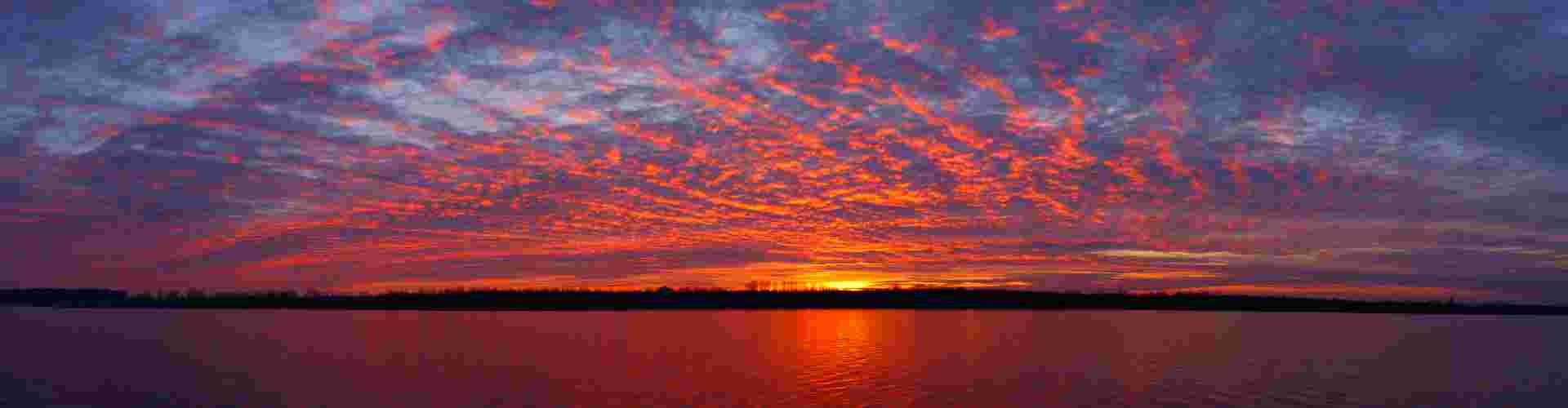
Banner - 1920 x 500 pixels
Use for page banner and as the hero image within a Content Collection (main image that shows on a tab).
Hero - 1100 x 735 pixels
Use for content item images within a Content Collection, ...
Half-size hero - 1100 x 538 pixels
Use when you have a large amount of image showing together on the page (e.g. https://www.intrepidtravel.com/eu/asia under 'Destinations in Asia').